Big Data, Deep Roots
I scraped 31.6 million records. Ancestry predicted surname status at r = 0.9.
TL;DR
- Across roughly 11,000 American surnames, ancestry predicted our composite socioeconomic score at r = 0.899 in cross-validation.
- The top ten surnames were all Indian. Selective migration is central to understanding the rankings.
- Surnames capture a surprising amount of social history. Who migrates, who takes a DNA test, and how surnames cross populations all matter.
Look up your surname · Download the data · Play Surname Guesser
The long road
Government salaries. Occupation titles. Physician licenses. Criminal records. Wikipedia.
I spent about four months scraping and cleaning this project: 31.6 million records across the processed datasets, plus 11,008 surnames with 45 ancestry estimates each from 23andMe.1 The paper, written with Emil Kirkegaard, is now published in Comparative Sociology. (Van Pelt & Kirkegaard, 2026)
The trick was simple. 23andMe's surname pages displayed only the top three ancestries, but the other 42 were embedded in the page. Extract them, join the surnames to the other datasets, and you can ask how much ancestry predicts about surname-level outcomes.
After matching surnames to ancestry coverage, this is what remained:
| Dataset | Records with ancestry coverage |
|---|---|
| Government salaries | 9,243,123 |
| Occupational prestige | 8,314,726 |
| Criminal records | 3,398,752 |
| Physician licenses | 2,036,473 |
| Wikipedia intellectuals | 51,464 |
Matched records from Table 1 of our paper. The datasets overlap; these are not counts of distinct people.
For salaries, the median surname had 270 observations. So for many names we had substantial information about average outcomes, rather than a handful of anecdotes.
The collection took months; the publication process took about a year. Here are the findings I found most interesting. There's also a game using the data at the end.
Ancestry gets you to r = 0.9
We combined government salary, occupational prestige, physician licensure, and criminal-record representation into an S factor: a composite score of surname socioeconomic standing. Technically, this is the first principal component: the common pattern across the four measures, with criminality reversed so that higher scores consistently indicate more favorable outcomes. Surnames with higher occupational prestige tended to have higher salaries, more physicians, and fewer criminal records relative to their population size.
Wikipedia was analyzed separately; its coverage was too patchy for the composite. The median surname had just two Wikipedia intellectuals, and roughly one in five surnames lacked a value altogether.
Using ancestry alone, XGBoost predicted this score at r = 0.899, or about 81% shared variance between predictions and observed scores. This was cross-validated across surnames, with similar error on a held-out test set.
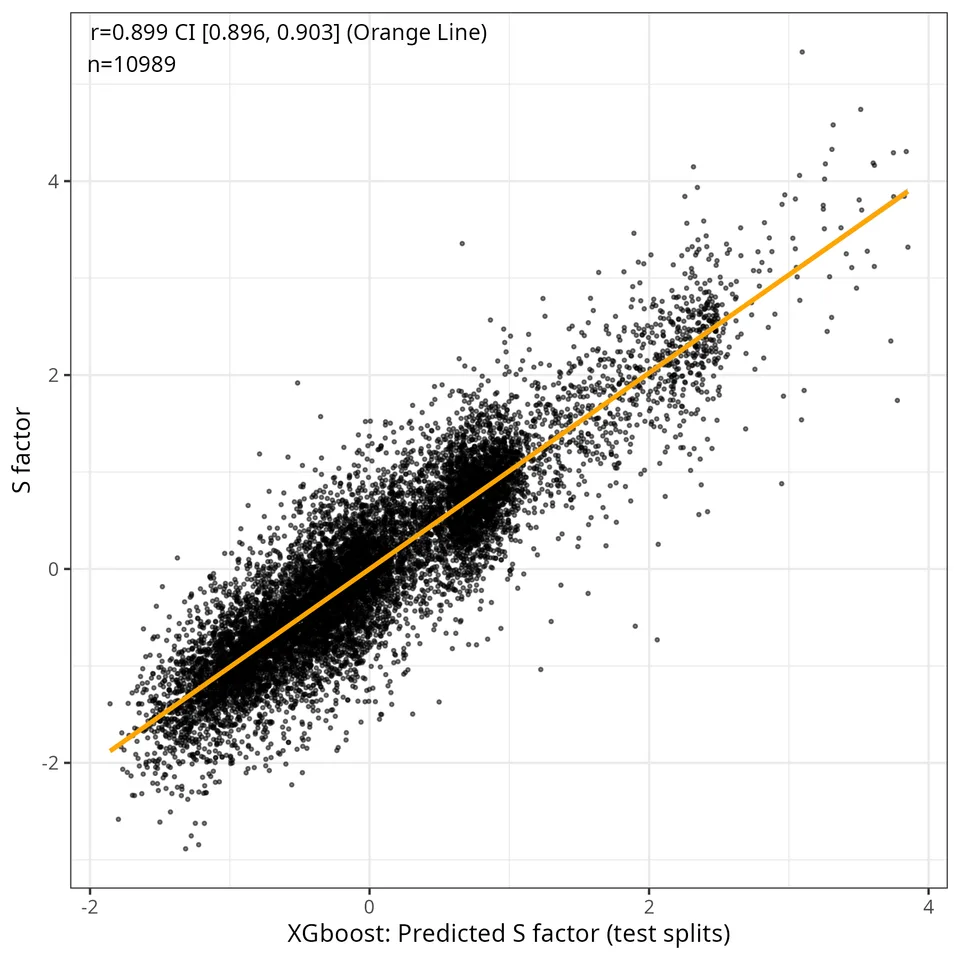
Each point is a surname. Predictions come from test splits, rather than fitting and scoring the same observations.
The fancy model helped, but most of the relationship was already linear. A plain additive model reached r = 0.846; adding interactions raised it to 0.889. The remaining gains were small. Squaring the correlations, the linear model captured about 89% of XGBoost's predictive strength.
The relationship also appeared across the separate outcomes. Ancestry models correlated 0.825 with physician licensure, 0.822 with criminal-record representation, 0.737 with occupational prestige, and 0.608 with government salary. Salary was the weakest of these, but hardly unrelated.
That is a strong result for surname averages. It does not mean ancestry explains 81% of an individual's circumstances, or identify how much of the association is genetic rather than social.
Indian surnames at the top
Next we asked what each model predicted for a hypothetical surname with 100% of a given ancestry. The leading clusters were South Indian, Ashkenazi Jewish, North Indian, and Arab.
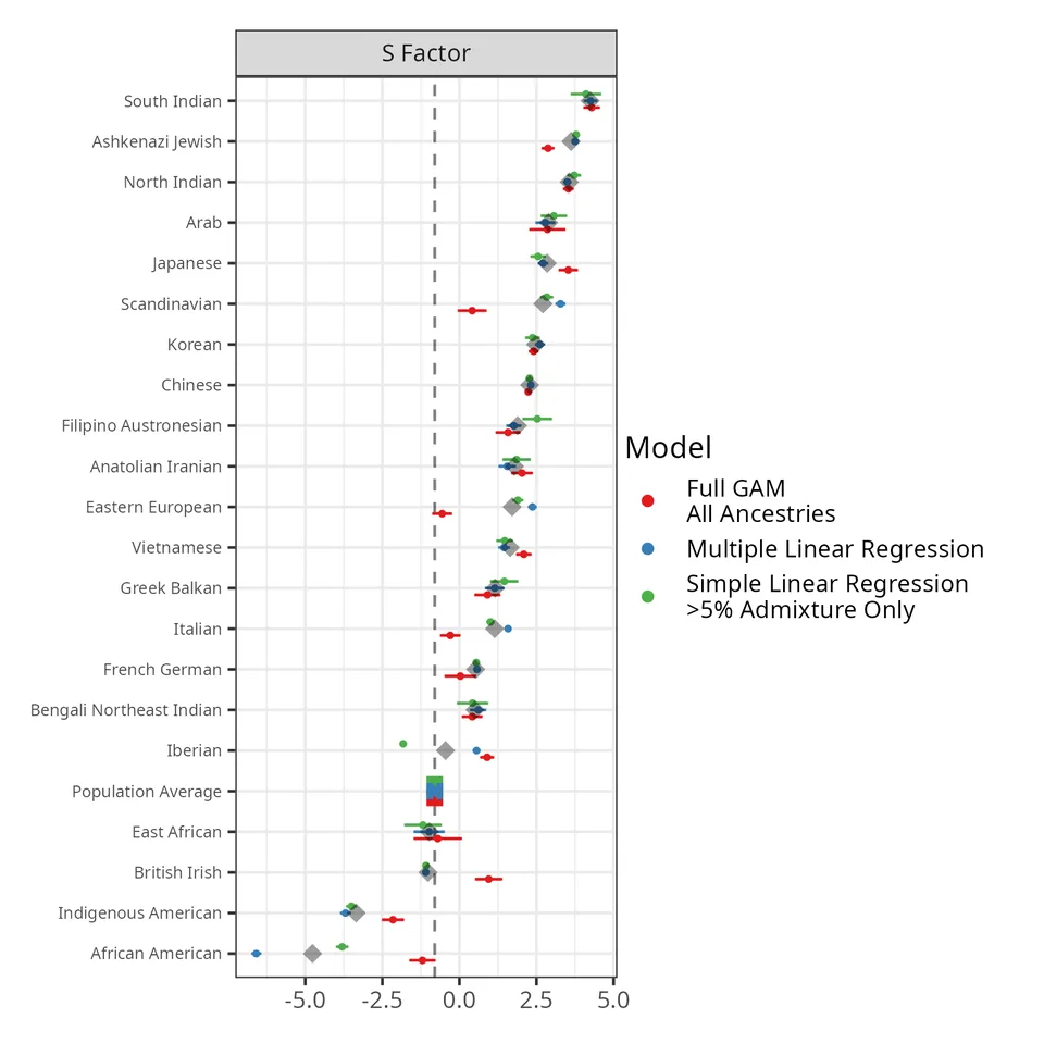
Model estimates at 100% ancestry. These are extrapolations where the data lack nearly homogeneous surnames.
The Indian result also appeared directly in the observed surname rankings. The top ten were Agrawal, Gupta, Iyer, Jain, Patil, Goel, Parikh, Srinivasan, Krishnan, and Rao. Horwitz, an Ashkenazi surname, first appeared at number 16.
So what is going on?
Selection on steroids
Indian Americans are a highly selected slice of India. The discussion cites a review reporting that over 90% of earlier Indian migrants to the US came from upper castes, representing roughly 30% of India's population. Education, resources, and US immigration rules each add another filter. (Alamgir et al., 2022)
The exam data make the scale of selection unusually vivid. Of the top 1,000 scorers in India's 2010 Joint Entrance Exam, 36% migrated abroad. Among the top 100 it was 62%; among the top ten, nine left. The US was the main destination. (Choudhury et al., 2023)
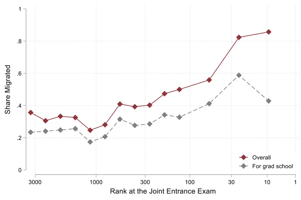
Choudhury, Ganguli & Gaulé (2023), Figure 1. Better exam ranks are to the right. Red shows migration overall; grey shows migration for graduate school. These are general-category candidates and migration to any foreign country, not just the US.
You should expect this to leave a mark on American surname statistics. The selection happens before arrival: access to education, success in a fiercely competitive examination system, and the means and qualifications to move abroad.
The Indian clusters also ranked highly on physician licensure and among the lowest on criminal-record representation. So the result extends beyond which surnames happen to earn more in government employment.
India is the outlier
The stereotype result is especially interesting. Jensen and Kirkegaard asked Americans to rate the intelligence of people from different countries, then compared the average ratings with national IQ estimates. India stood well above the fitted line: Americans rated Indians much more highly than the study's country-level estimate would predict. (Jensen & Kirkegaard, 2025)
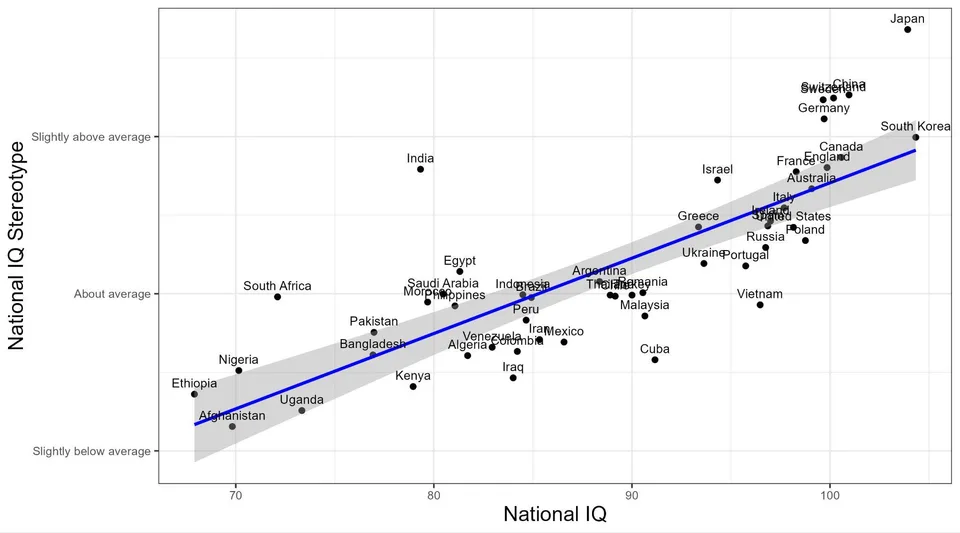
Jensen & Kirkegaard, linear-fit plot from the public preprint, p. 8. The vertical axis measures Americans' perceptions; the horizontal axis uses the study's national IQ estimates. Shading shows the regression's 95% confidence interval.
The authors suggest that Americans' encounters with a highly selected Indian diaspora help explain the gap. That fits the migration story here. The survey did not test the intelligence of Indian Americans or establish why respondents held those views, so the plot is suggestive rather than a causal test of selection.
Arabs and Iranians
The Arab and Anatolian/Iranian clusters are another interesting case. Arab ancestry ranked fourth on the S factor and third on occupational prestige.
The discussion points to religious as well as educational selection. Historical estimates cited in the paper put Christians at 63–77% of Arab Americans, a very different composition from the predominantly Muslim populations of many origin countries. The educational literature discussed in the paper documents substantial Christian advantages in Lebanon, making this a plausible part of the migration story. These historical estimates should not be read as a current demographic census. (Van Pelt & Kirkegaard, 2026)
For Iranians, the paper emphasizes students already studying in the US when the 1979 revolution occurred, and educated emigrants who subsequently left. Feliciano's comparison placed Iranian immigrants highest in educational selectivity among the origins she studied. (Feliciano, 2005)
Her table puts some numbers on the selection story:
| Origin | Educational selectivity |
|---|---|
| Iran | 0.884 |
| Hungary | 0.880 |
| India | 0.858 |
| Japan | 0.670 |
| China | 0.667 |
| Mexico | 0.200 |
Selected rows from Feliciano (2005), Table 1. The net difference index compares immigrants' schooling with nonmigrants from the same origin: higher values mean stronger positive selection. These are historical migration cohorts, not a current ranking or a measure of absolute education levels.
PAAIA's 2025 survey provides another illustration of how distinctive the diaspora sample is: 24% of respondents identified as Muslim, and 79% had a four-year degree or postgraduate education. Those figures describe the survey respondents, not the ancestry of every person carrying an Iranian surname. (Americans, 2025)
The relevant comparison is therefore with the particular people who emigrated. A country's average tells you much less when its emigrants come disproportionately from a small, educated stratum.
Why are British and Irish estimates so low?
This result looked odd to us too. The paper points to a measurement problem.
Take Washington. In the Census, 87.5% of people with that surname identified as Black. In the 23andMe sample, its estimated African American ancestry was only 56%, alongside 23.2% British/Irish ancestry. Self-identified race and genetic ancestry are different measures, and customers who buy DNA tests are also a selected sample.
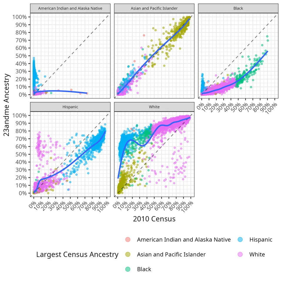
The Census and 23andMe do not measure the same thing or sample the same people.
Shared surnames and selective testing make it difficult to separate the British/Irish coefficient from the outcomes of African Americans carrying those names. Iberian ancestry has a related problem with Hispanic surnames. Extrapolating either coefficient to 100% ancestry can give misleading results.
We reduced the extrapolation problem by combining related ancestries into broader clusters. All 45 original ancestries remained in the overall prediction analysis; the grouped categories were used for the 100%-ancestry comparisons. Two clusters, Egyptian and Indonesian/Thai/Khmer/Myanma, were excluded from interpretation because their estimates were too unstable.
The Egyptian example is instructive: it could rank first on physician licensure but eighteenth on occupational prestige. Only 41 surnames exceeded 5% Egyptian ancestry, and the maximum was 39.4%. A model projecting all the way to 100% is being asked to do a lot of guessing.
That is why the discussion matters as much as the headline correlation. Surname data reveal a lot, but interpreting a coefficient requires knowing which population actually produced it.
Read the published paper for the full methods, comparisons, and discussion.
Explore your surname
Search the surname-level data behind the paper and game. The explorer shows ancestry composition, measured outcomes, and model predictions; the complete processed dataset is available to download below.
What’s in a surname?
Look up one of 10,989 American surnames. Explore its ancestry estimates and the outcomes behind the paper.
Type to search. Use ↑ ↓ and Enter to choose a match.
A surname carries a little social history.
Choose one above to see the numbers.
Take the data with you
10,989 surnames · all 45 ancestry estimates · outcomes, predictions & confidence intervals
Processed surname aggregates used by the game and explorer. See the data dictionary for column definitions and units.
Surname Guesser
How much of this can you predict yourself? Pick among three options, then compare your answer with the surname data. You have three lives.
Footnotes
-
This is a count across processed metric datasets, not 31.6 million distinct people: occupational prestige is derived from the salary records, for example. Matching to ancestry reduced the samples further. The final game and prediction plot cover 10,989 surnames. ↩